Quality Control Prevents Embarrassing Business Photos
snaptosuit · August 13, 2026
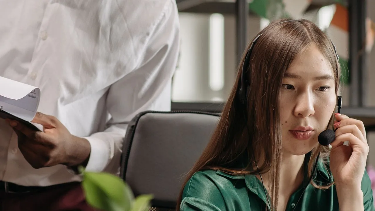
There is a special kind of photo that nobody consciously chose and that shows up everywhere anyway. Your colleague is smiling, yes. But behind him hangs a half torn poster, on the left a stranger's arm juts into the frame, and the ceiling light casts a shadow straight across his forehead. On its own it seems harmless. On a team page with twenty images like it, that adds up to an impression nobody intended. The impression that there is nobody here who pays attention.
Quality control for photos is treated as small stuff. As something you leave to gut feeling. Looks good, that'll do. That is exactly where the mistake lies. Gut feeling systematically overlooks the same things, because it focuses on the face and tunes out the rest. A brief, deliberate check does not. It looks precisely where the eye looks away on its own.
Why Your Eye Fails With Your Own Team
When you look at a photo of a familiar person, you see the person, not the image. You recognize your colleague's smile and immediately think of the last lunch break you shared. The crooked framing, the color that is too warm, the busy background, all of that vanishes behind familiarity. That is why teams so often wave through images at which a stranger would stop short instantly.
The fix is not more talent, it is more distance. You have to look at the photo the way a candidate sees it who is googling your company for the first time. That person knows no one. They read only signals. A crooked, dark image tells them something about your diligence long before a word is said about culture or values. And you have no control over the conclusion they draw, except through the image itself.
The trick is to separate the check from the feeling. Don't ask whether you like the photo. Ask whether it meets a list of criteria. Feeling is biased. A list is not.
The Silent Mistakes That Cost the Most
It is rarely the dramatic blunders that do the damage. A completely blurry image is spotted at once and thrown out. The dangerous ones are the small deviations that pass individually and tip the scale in aggregate. One colleague was shot outdoors in summer, warm light, green background. The colleague next to her in the office under cold neon light. Both images are fine on their own. Side by side, it looks as if the two don't belong to the same company.
A second classic is the gaze. In one photo the person looks straight into the camera, open and present. In the next, someone looks slightly past it, because they were distracted at the moment of the shot. The difference is tiny. The effect is not. One image seeks contact, the other avoids it. On an About Us page, that contact decides whether someone trusts you.
Then there is the background. A chaotic full bookshelf, an open office door with colleagues cut off in the frame, a tangle of cables under the desk. None of it is terrible. All of it pulls attention away from the face. And attention is exactly what a portrait needs and should never squander anywhere else.
A Checklist That Runs in Thirty Seconds
You need no eye and no training for this. You need a fixed order that you work through the same way for every image. First the gaze. Does the person look at the camera or past it. Then the sharpness. Are the eyes sharp, not the shoulder, not the background. Then the light. Is there a hard shadow on the face, or is it evenly lit.
Move on to the framing. Does the head sit calmly in the frame, or is it cut off, shifted, too far down. Then the background. Is it calm, or does it fight the face for attention. And finally the color, though here you don't check the single image, you place it next to the others. Does it fit the row, or does it break out of it. If an image fails at any of these points, it goes back. No discussion.
The crucial thing is that you always run this check before an image is published, never after. A photo that only turns out embarrassing once it is out there has already done its damage. The thirty seconds beforehand are cheap. The correction afterward never is, because by then someone has already seen the wrong image.
Why Consistency Is the Real Quality
In the end it is less about the perfect single image than about the calm overall impression. Twenty good photos that all look different come across worse than twenty solid photos that fit together. The reason lies in perception. The brain reads a consistent row as order and intent. It reads a mixed row as chance. And chance is the last thing you want to signal about a company that customers are meant to trust with their money.
That is why the toughest test question is not whether an image is beautiful. It is whether it belongs with the others. An outstanding photo that falls completely out of line hurts the row more than an average one that fits in. Once you understand that, you suddenly make quite different decisions.
This is exactly where the advantage of modern, studio free approaches shows, ones that produce all images by the same rules from the start. Same light, same framing, same background. Then quality control shifts from tedious weeding out to one final checking glance. And that glance is easy when everything already fits together anyway.