The Easiest Website Upgrade Is Sometimes Not a New Design
snaptosuit · August 23, 2026

The reflex is always the same. The website feels tired, something is off, so a redesign it must be. New fonts, new colours, a modern layout, ideally from the ground up. It costs a lot of money, takes months and ties up half the company in rounds of feedback. And in the end you often get a site that looks different but, oddly, hardly feels any better. Because the real problem lay somewhere else.
I would argue that in many cases the most expensive upgrade is not the most effective one. Before you rebuild the whole house, it pays to take a sober look at who actually lives in it. Because a website does not live off its grid, it lives off the faces looking back at you from it. And those are exactly what a redesign usually overlooks.
The redesign as an expensive reflex
A new design feels like progress, and that is precisely what makes it so tempting. You see something new right away, you can show it off, there is a before and an after. Yet that visible change easily obscures the question of whether it actually changes anything. Often the facade gets polished while the core stays untouched. The menus move, the colours shift, and the visitor still feels the same as before.
The reason is that a layout mainly orders things. It guides the eye, it creates structure, it makes sure people find their way around. What it cannot do is create warmth. No grid, however elegant, makes a company feel approachable if the people inside it stay pale. You can build the most beautiful stage. If the people on it look like they wandered in by accident, the stage does not help.
The images carry the website, not the grid
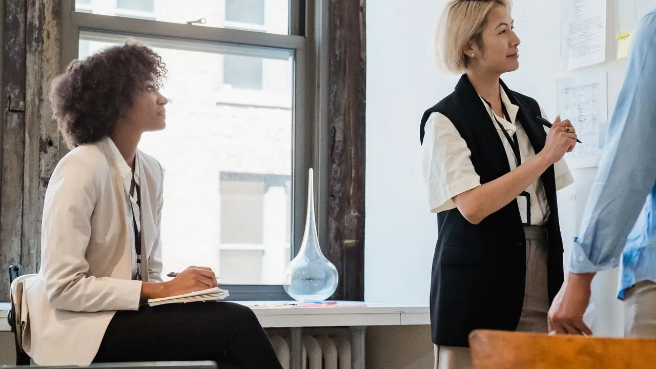
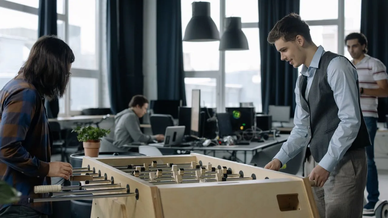
Run a thought experiment. Take a well-designed website and swap every careful portrait for dark, crooked phone photos. The structure stays identical, the layout is the same, and yet the whole impression tips into the cheap. Now do it the other way round. Take a plain, almost boring page and drop in uniform, professional faces. Suddenly the whole thing feels tidy and serious, even though nothing about the design was changed.
This experiment shows where the real power sits. The grid is the skeleton, but the images are the face. People look to people, that is a deeply wired reflex. On a page full of text and boxes, the eye first snags on a face, every single time. And what that face radiates decides the tone of the whole encounter, long before the layout plays any role at all.
That is why swapping bad photos for good ones is often the most underrated upgrade there is. It costs a fraction of a redesign but strikes exactly where the visitor is most sensitive. You do not have to change a single line of the structure to lift the effect noticeably. You only have to take the faces seriously that are already there.
What a change of images really changes
The effect runs deeper than mere looks. When the portraits on your page are coherent and current, it changes how credible everything else feels. A text about care reads differently when the faces beside it radiate care. A promise of reliability rings hollow when the images beside it feel careless. The photos are the silent proof of what you claim in words.
Then there is currency. Many sites fail not because of the design but because the people shown are long gone from the actual team. A fresh set of portraits clears up that break and brings the company back into the present. That is no cosmetic tweak, it is a correction to the truth of how you present yourselves. And the visitor feels truth, even if they could not name exactly what.
Faces first, layout second
To avoid a misunderstanding. I am not saying design does not matter. A genuinely outdated, unusable layout deserves to be renewed, no question. But the order is often wrong. Too many rush into the expensive rebuild without first trying the cheapest and most effective thing. Faces first, framework second. In that order you get the most out of every franc you invest.
The reason this simple step was avoided for so long was practical. A photo shoot for the whole team, uniform and regular on top of that, was expensive and a hassle to organise. So it stayed a patchwork of old images, and instead people tinkered with the layout, because that felt more tangible. Today the hurdle sits far lower. Modern, studio-free approaches turn plain selfies into uniform, professional portraits, without a studio day and without much effort.
So the next time you find yourself thinking about a redesign, ask yourself an uncomfortable question. Is it really the layout, or is it the faces living inside it. In a surprising number of cases the answer is the second. And then the smartest upgrade is not the loudest but the quietest. You swap the images, and the page that looked tired before suddenly stands upright again.