Advisory Boards Look Stronger With a Unified Look
snaptosuit · August 7, 2026
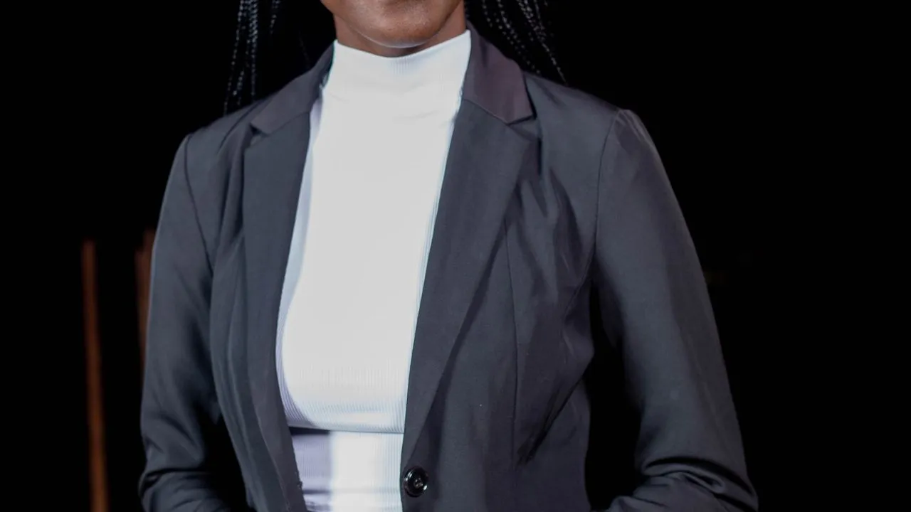
An advisory board is a strange construction. You gather people who are not employed by you, who have their own companies, titles and calendars, and you ask them to lend their name and reputation to you. That is exactly where the value lies. A good advisory board is borrowed credibility. And that very credibility is what you often give away right there in the presentation.
Because what does such an advisory board page typically look like. Everyone supplies the image they happen to have on hand. One a crisp business portrait, another a casual snapshot from a conference, a third something that smells of a job-application photo from another decade. Five sharp minds, five completely different visual worlds. What is missing is the one signal an advisory board has to send. That these people stand behind you together.
An Advisory Board Lives on the Impression of Unity
An advisory board has no formal power like a supervisory board. Its effect is purely symbolic, and symbols live on their form. If the portraits clash wildly, the body visually breaks into individual pieces. Instead of a closed circle of clever supporters, you see a list of names that happened to land on the same page. The circle becomes an enumeration, and an enumeration impresses no one.
A unified look reverses that. As soon as all advisory board members appear in the same light, against a similar background and in the same crop, a team emerges visually. The eye reads belonging before the mind even knows the names. This visual bracket suggests exactly what you want to claim. That a coordinated group of experts deliberately stands together here. The look becomes proof of seriousness.
Why the Patchwork Even Devalues the Big Names
What is truly annoying about an inconsistent advisory board is that it downplays the strengths. You may have won a well-known entrepreneur, a respected professor, a seasoned former board member. Big names. But if their photo looks like it was quickly cut from an old talk, the name loses its shine. The weak presentation drags the strong person down, instead of the strong person lifting the presentation.
Conversely, a good, shared look also lifts the less prominent members. Anyone depicted in the same confident style as the heavyweights beside them benefits from the company. The unified frame distributes authority evenly across the whole group. That is how a mix of differently known people becomes a body that carries weight as a whole. That is precisely the effect an advisory board is meant to achieve.
A Small Thought That Turns the Matter Around
Consider for a moment who you are actually showing the advisory board to. Not for the members themselves, they know each other. You show it for outsiders who want to assess you. For the investor checking who advises you. For the major client who wants to know whether there is substance behind you. For the top candidate weighing whether this environment fits them. These people read the advisory board as a seal of quality, and a seal has to be cleanly printed.
A frayed presentation damages the seal. It says, beneath the surface, that the relationship with these advisors is loose, almost incidental. A coordinated presentation says the opposite. It signals that you take this body seriously and cultivate it, and that the advisors carry that closeness with you. Borrowed credibility thus becomes settled credibility. The difference is decided by the visual language.
The Unified Look Reflects Back on You
There is an effect that is easy to underestimate. An advisory board that presents itself as visually unified also changes how the members themselves relate to you. Anyone who sees themselves as part of a well-kept, serious body identifies with it more strongly. A careless presentation, by contrast, also signals to the advisors that their role is mere decoration. And people commit less to something that is presented carelessly.
A careful, shared look is therefore also a gesture of respect toward the advisors. You are saying that you take their involvement seriously and stage it well. That costs little and does a lot. Not infrequently, members of a well-presented advisory board feel more obligated to actually contribute, rather than merely lending their name. The look, in a sense, cultivates commitment.
How Your Advisory Board Gets a Shared Face
The practical objection is obvious. An advisory board rarely meets in person, the members sit scattered, a joint shoot is a fantasy. That is exactly where the unified presentation almost always failed before, which is why the patchwork remained the norm. That objection is outdated today. There are modern, studio-free ways to create coordinated portraits from plain selfies of the individual members, with the same light and the same style, without anyone having to travel.
This way even an advisory board scattered across several countries can be brought into a shared look, in a short time and without scheduling acrobatics. Everyone supplies a simple photo, and out comes a coherent gallery that looks as though it was created on a single day. Five solo players on paper finally become what you always meant. A body.
In the end the message is simple. An advisory board is only as convincing as the impression of its unity. Anyone who leaves the images to chance gives away the very effect they once won the board for. Anyone who gives them a shared face turns a list of names into a credible promise. And promises that look unified convince.