Newsletter Senders Land Harder With a Real Face
snaptosuit · 2 สิงหาคม 2569

Think of the last company email you genuinely looked forward to opening. It probably did not come from an anonymous sender like info or newsletter, but from a person. From someone whose name you knew and maybe even whose face you could picture. That is exactly where an underrated lever in all of email marketing lies. People would rather open mail from people than mail from companies.
A newsletter is, at its core, a letter. And a letter has a sender. When that sender gets a face, the whole relationship between you and the reader changes. A broadcast becomes an address. A channel becomes a contact. That sounds like a nuance, but it often decides the crucial click. Because in a crowded inbox, whatever feels approachable wins.
The Inbox Is a Battle for Trust
An average inbox is a battlefield. Dozens of emails a day, most of them mildly interesting, many of them advertising. The reader makes decisions by the second. Open, ignore, delete. That decision is not made after careful review, but on a quick gut feeling. And that gut feeling reacts strongly to one signal. Do I know the person writing to me?
A real sender name with a real face sends exactly that signal. It says, no system is writing to you here, but a person. That lowers the defences. Advertising from a company gets tuned out reflexively. A message from a person you recognise gets one more chance. Across many sends, that small difference adds up to a big one. Trust grows through recognition, and recognition needs a face.
That is why many successful newsletters deliberately rely on a fixed sender personality. Always the same name, always the same picture, issue after issue. Over time, the unfamiliar sender becomes a familiar contact. The reader gets used to the face and opens almost automatically. That is not manipulation. It is simply how human relationships work, including the digital ones.
Where the Face Does Its Work
There are several places where a portrait can work inside an email. The most obvious is the signature at the end. A warm, clear picture next to your name and role rounds off the letter and gives it a human face at the close. That is common enough by now, but many use a poor picture or none at all and squander the effect.
Often more effective is a small portrait right at the start, alongside the personal greeting. When a newsletter opens with a genuine welcome from a recognisable person, the reader feels addressed rather than served. They read the first lines differently, as if someone were sitting across from them and talking to them. That tone carries through the whole email and noticeably raises the willingness to keep reading.
And then there is the sender image itself, which appears next to the subject line in many mail clients. It helps decide whether an email looks like a person or like a mass mailing in the overview. Here too, a clear face stands out positively, while a logo or an empty field disappears into the grey mass. Each of these places is a small stage where a good photo works for you.
The Trap of the Wrong Picture
Showing a face, however, is only half the battle. It matters a great deal which one. A blurry, dark, or crookedly cropped photo can even turn the effect on its head. Instead of closeness, you get an impression of carelessness, and that unconsciously transfers to the entire content of the email. Anyone who cannot manage their own photo is trusted less to be careful with the rest.
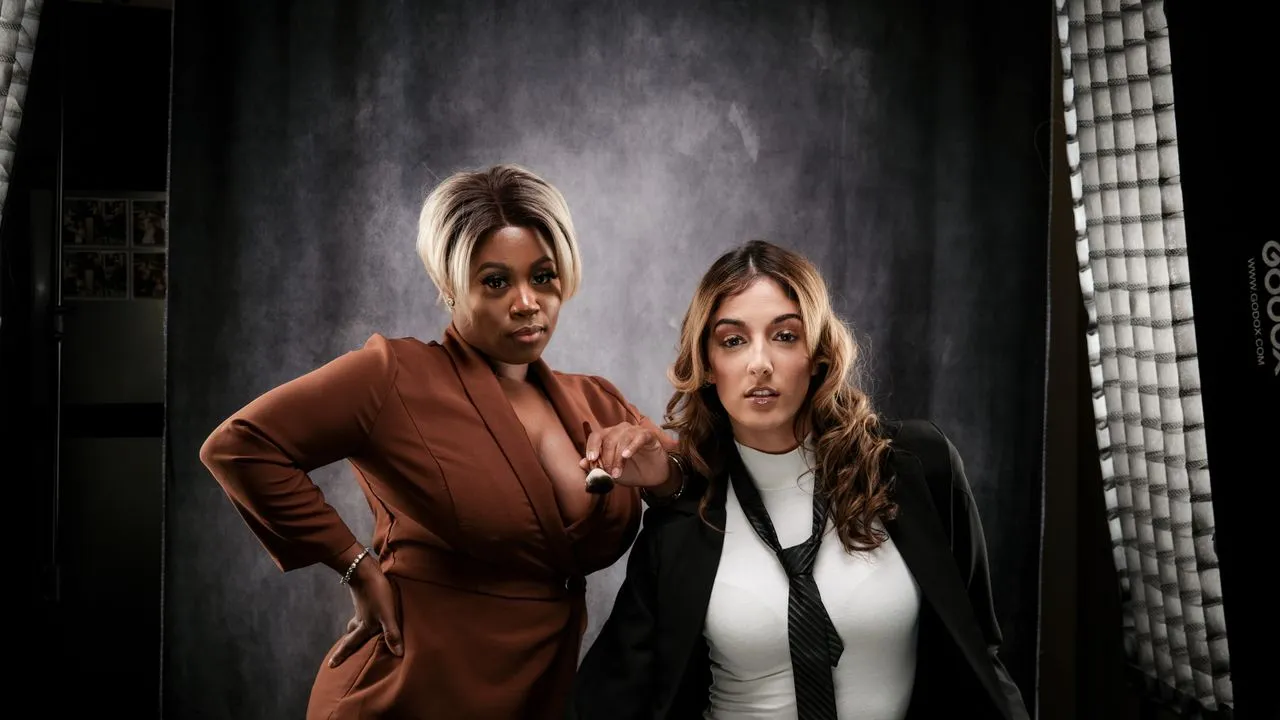
It gets especially tricky when several people appear in one newsletter, for instance in a team update. When a high-quality portrait sits next to a shaky phone snapshot there, it is instantly noticeable and feels off. The reader registers the gap even if they cannot name it. Consistency is just as important here as quality. A team that appears together should also look good together.
The solution is not an elaborate photo shoot before every issue. The solution is a single good portrait per person that then gets used consistently. Done right once, it carries through countless sends. The effort is incurred exactly once, the benefit many times over.
A Detail With Leverage
Compared to everything that takes work in a newsletter, the sender image is a tiny detail. You fine-tune subject lines, test send times, rewrite copy. And all the while the simplest lever might be lying there unused. Namely, the question of whether your emails have a face or stay anonymous.
I would advise everyone to take this detail seriously. A good, consistent portrait of your sender costs a little effort once and pays in permanently after that. It makes your communication more human, your open rates tend to improve, and your relationship with the reader becomes more stable. For a single small picture, that is a remarkably large effect.
If you notice that this one good picture is exactly what is missing, or that your senders on the team look wildly different, then it is worth looking at modern, studio-free routes to clean portraits. They deliver coherent results from simple source photos and make sure your emails finally get the face they deserve.