Webinar Pages Convert Better With Strong Speaker Photos
snaptosuit · 3 สิงหาคม 2569
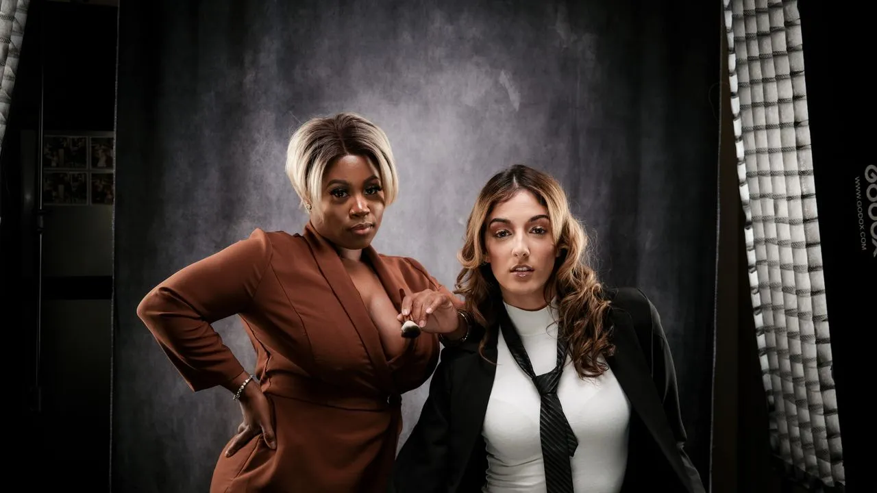
A webinar usually costs attendees no money, but it costs something many people value more than money. It costs time. Whoever signs up blocks an hour or more in the calendar and risks losing it to empty promises. That is exactly why registering for a webinar is not the easy decision the zero price suggests. And that is exactly why a single element on the registration page often decides between yes and no. It is the face of the person speaking.
Many webinar pages treat the speaker photo as an afterthought. A small round picture somewhere at the bottom, often copied from an old profile, grainy, dark, joyless. The title, by contrast, is set in bold and large, the agenda is polished, the countdown is ticking. Only the person meant to guide you through the topic for the next hour stays a shadow. That is a mistake, because you do not sign up for a title. You sign up for a person.
You Only Trust a Talk Once You Trust the Face
Imagine you have to choose between two free webinars on the same topic. Both promise practical tips, both last an hour. On one page, a clear, warm portrait smiles at you, well lit, with a calm gaze and an open posture. On the other, you find only a name and a tiny, blurry picture that looks like it came from a job application from years ago. Which one do you click Register on? The answer is almost always the same, and it has nothing to do with the content, which you do not even know yet.
The reason is simple. In a webinar, you hand yourself over to the guidance of a stranger for a while. Your brain wants to know beforehand whether that person is worth it. A strong portrait answers that question in a split second with a quiet yes. It signals composure, warmth, and the care of a person who knows they are stepping onto a stage. A weak picture sends the opposite and leaves you doubting whether the hour is worth it.
The Stage Does Not Begin in the Talk, but on the Registration Page
There is a stubborn misconception. People believe the presenter only has to win the audience over in the webinar itself, there, with voice, knowledge, and presence. The registration page is supposedly just a formality before that. But the stage begins earlier. It begins the moment someone opens the page and weighs whether to invest their time. The speaker photo is the first appearance, long before the first word. Whoever squanders that appearance loses an audience that never shows up.
I have seen a company noticeably raise the registration rate for its webinars without touching the topic, the title, or the description. They only swapped the speaker pictures. Before, a jumble of scraped-together snapshots in a wild mix, sometimes a phone photo, sometimes a crop from a group picture. After, calm, uniform portraits with clear light and an open gaze. Now the prospects saw professionals in front of them, not accidents. The number of people who dared to add the calendar entry rose noticeably. The talk was still the same. Only the trust arrived earlier.
What a Good Speaker Portrait Actually Delivers
A strong speaker photo works on several levels at once. First, it creates closeness. A face that attendees have already seen before the event feels familiar in the webinar, almost like an acquaintance. That familiarity lowers the distance and makes it easier to stay and not drop off after five minutes. An anonymous presenter has to earn that closeness first. A familiar face starts with a head start.
Then it creates authority, but the quiet, credible kind of it. A portrait that radiates calm and clarity says without words that here stands someone who has command of their field. It is not about glamour or model looks. It is about coherence. When the picture fits the topic and the person, the impression of competence emerges all on its own. And finally, a good photo creates consistency. When several presenters appear in the same visual language, the whole series looks all of a piece and professionally run.
When Several Speakers Appear, the Shared Look Counts
It gets especially tricky with webinars that have several presenters or with a series running over many weeks. Then completely different visual worlds often collide. One person with a professional studio picture, the next with a dark selfie, the third with a crop from the last company party. That break is instantly noticeable and feels unsettled. It tells the story that different worlds were hastily shoved together here, instead of a jointly planned event.
A uniform look for the speaker portraits solves this problem elegantly. Same picture height, similar light, calm background, comparable crop. And already the impression emerges of a well-rehearsed team that appears together. That elevates not only the individual presenters, but the whole brand behind them. Anyone planning a series should therefore think about the pictures of everyone involved from the start and not leave to chance whatever happens to be in each person's profile.
How to Make Your Webinar Pages Stronger Right Away
The first step is an honest check. Open your last webinar page and look at the speaker photo as if you were seeing it for the first time. Would this picture move you to sign up, or would you look past the face and only pay attention to the title? If the latter, then the photo is working against you. It fills a slot instead of building trust. Give the portrait more room on the page, because whoever is meant to guide you deserves more than a postage stamp in the corner.
The second step is to have good pictures available in the first place, and to do so without every appearance turning into a photo production. This is exactly where the hurdle used to lie. A webinar is scheduled quickly, a photo session is not. So you took what was there, usually an old or weak picture. That excuse no longer holds today. There are modern, studio-free routes to turn plain selfies into coherent, uniform speaker portraits, so that even webinars scheduled on short notice can appear with strong faces. The effort stays small, the effect on registrations is large.
In the end, the math is sober. You invest a great deal in the title, agenda, and promotion of a webinar so that people find their way to the registration page at all. And then a face often decides whether they take the final click. A strong speaker photo is therefore not decorative trimming. It is the quiet doorman who turns curiosity into attendance. Whoever takes it seriously fills their webinars not with better promises, but with a more credible first impression.