Co-Working Spaces: Show the Community, Not Just the Rooms
snaptosuit · 2 เมษายน 2569

You know that one type of photo that hangs on almost every co-working website. The empty room in the golden morning sun. Perfectly tidy desks, a monstera in the corner, the coffee machine gleaming, the chairs at just the right angle. A lovely picture. It just tells the wrong story. Because nobody rents a desk because the plant sits there so prettily. People come to you because they do not want to wither away alone in their home office.
What you really sell is not a price per square metre. It is the feeling of walking in each morning and being greeted by name. It is the freelancer at the next desk who happens to have the contact you have been chasing for weeks. It is the Thursday evening round with an after-work beer. That is your substance, and that is exactly what is completely missing from your tidy room photos. You photograph the shell and leave out the core.
Empty rooms sell the wrong value
Try a thought experiment. Two spaces, same price, same location. One shows ten flawless pictures of empty workstations. The other shows people. Two people leaning over a laptop and laughing, someone focused in the phone booth, a small group mid-conversation in the coffee kitchen. Which of the two makes you instantly think, I would fit in there? It is never the empty room. People look for people, not furniture.
The empty room even has an unintended side effect. It comes across as cool and a little lonely, almost like an office building after hours. And people already feel lonely enough in their home study, otherwise they would never think of finding a spot with you in the first place. So you are showing them the very problem they are fleeing, only nicely lit. It is well meant and still misses the mark.
Faces tell people who works here
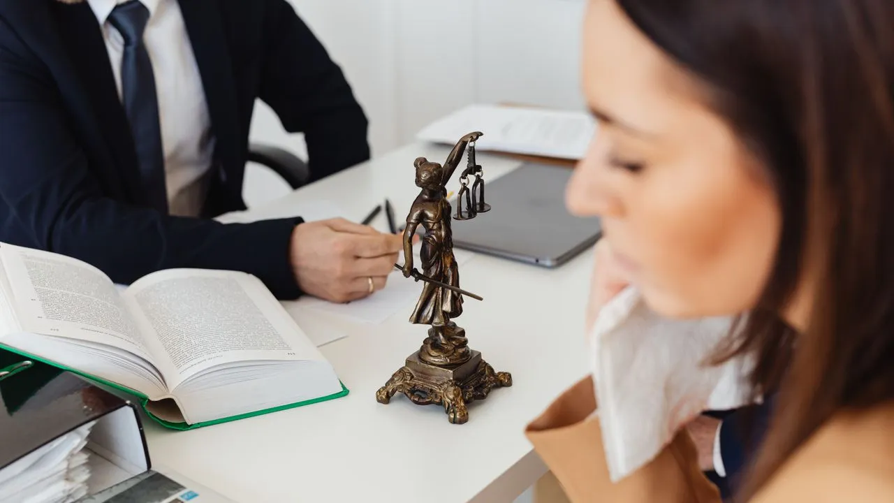
Community is a big word that sits on every second space website. But a word convinces no one. Show it instead. Portraits of your members, short introductions, who sits here and what this person does. The graphic designer who illustrates all day. The small start-up building its first product. The lawyer who runs his practice alone yet does not want to be alone. Anyone who sees these faces immediately understands what kind of neighbourhood they are joining.
This has a double benefit. Outward, similar people attract similar people. Anyone who sees that a lot of creatives and self-employed people sit with you quickly senses whether they want to belong. Inward, a member portrait like that is a gift to your community itself. Someone feels seen, welcomed, taken seriously. And a member who feels seen stays longer and tells others about it. That is the cheapest member recruitment there is.
My firm conviction is that you put your members in the picture far too rarely. You have interesting people under your roof every single day and still show the world nothing but the furniture. That is like a restaurant taking photos only of its empty dining room and never of a dish. The rooms are the frame. The people are the picture.
A consistent look holds the community together
Now comes the catch you will spot at once. Your members change constantly. Some stay two years, others book a month and move on. If you grab a random image for every introduction, one the person sent in themselves, your member wall becomes a patchwork. One photo from the beach holiday, the next a dark selfie from the car, the third a cropped LinkedIn shot in a completely different colour. Instead of togetherness, that shows randomness.
A shared visual style solves this problem elegantly. When all portraits have the same calm background, the same lighting mood and the same crop, a colourful pile of individuals becomes a visible community. At a glance you see, these belong together, even if in real life they may never have met. This visual glue is exactly what separates a felt community from a mere office share.
In practice this means you need a simple way to slot new members into the same look as soon as they move in. Not as one big project once a year, but continuously, at every onboarding. That keeps your community wall always current and always of a piece, no matter how fast the faces change.
What this means for you
Do not start with the technology, start with the mindset. Make the decision that from now on your people play the lead role and the rooms only a supporting one. That alone changes which images you put on the homepage, which stories you tell in the newsletter and how you talk about yourselves. You are not a landlord of square metres. You are the host of a community.
The usual objection, that getting good portraits of everyone is too much work, no longer really holds up today. You do not have to drag every member into a studio. It is enough to offer a straightforward, studio-free option that gives everyone a clean, consistent picture in a few minutes, one that matches your look. Whether it comes from a quick photo on site or from a good selfie is secondary.
In the end a simple truth remains. Your loveliest empty rooms will never bring you as many members as a single honest picture of people who feel at home with you. Show the community, not the set. Everything else is just real estate.